EDS Cabling · High-voltage cabins · Belgium. A cable turned into a logo, and a site that makes high voltage clear
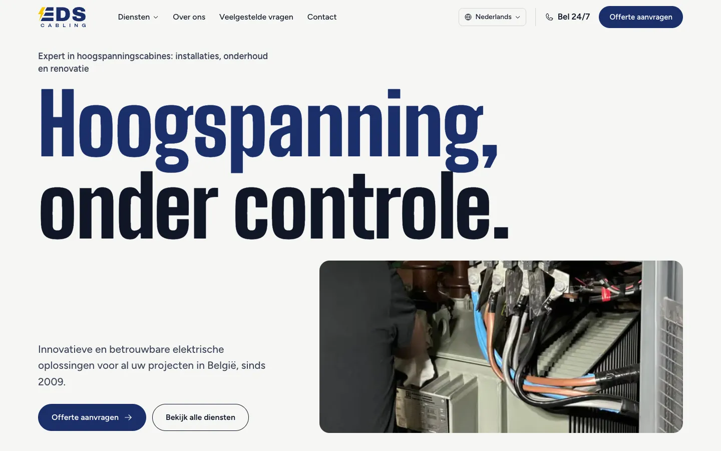
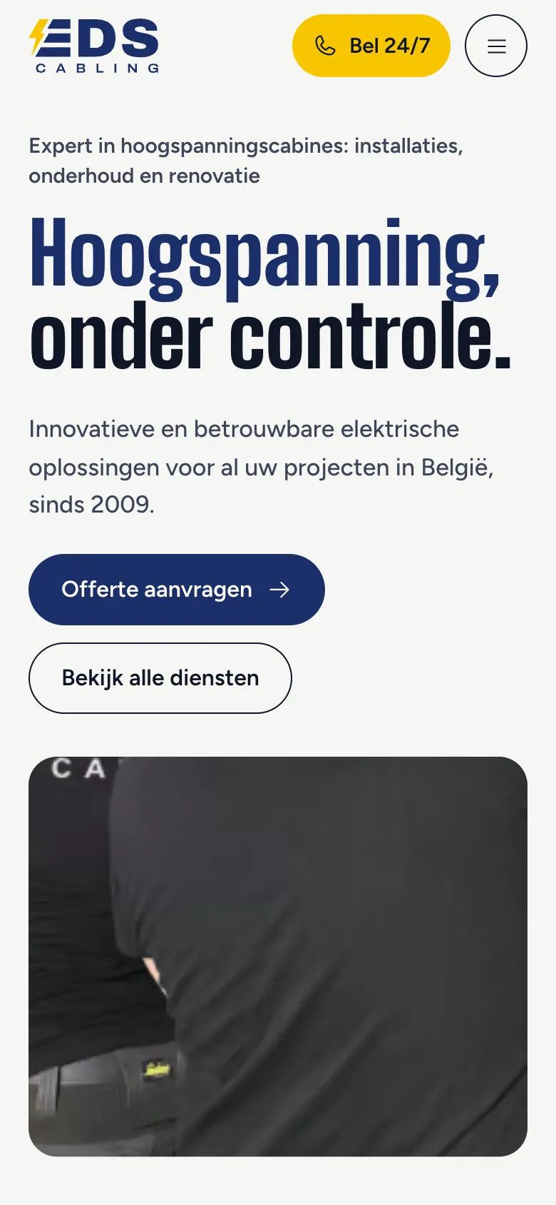
New brand identity and a full website redesign for EDS Cabling, a Belgian high-voltage cabin specialist: a logo drawn from a medium-voltage cable, a brand book, and a site in Dutch and French that leads to a quote request or a 24/7 emergency call.
- Services
- Brand identity, Website
- Year
- 2026
- Status
- Live at edscabling.be
The need
EDS Cabling has installed, maintained and renovated high-voltage cabins in Flanders and Brussels since 2009. Its clients are companies, building managers and industrial sites, searching in Dutch or in French. The website had aged, and the logo, a lightning bolt like many electricians use, did not set the company apart. It needed a brand you recognise on a van as well as on an invoice, and a site that explains a technical trade simply, then leads to a quote request or an urgent call.
Our approach
An opened-up cable that forms an E. The three arms of the E are the three cores of a medium-voltage cable, and the flash forming its spine is the current they carry. Every sloping edge of the logo follows the same 60° slant, like cables laid straight and parallel. EDS in broad capitals, CABLING spaced across the full width, like cable paid out along a trench. Navy carries the brand; yellow appears once per surface: the flash.
A brand book, and everything that carries the logo. A twenty-eight-page guide sets the rules: logo versions on six grounds, colours, typefaces (Archivo and Figtree), minimum sizes, what not to do. Then the materials: business card, letterhead, invoice, quote, work order, envelope, e-mail signature, and print files for workwear, helmets, vans and cabin plates.
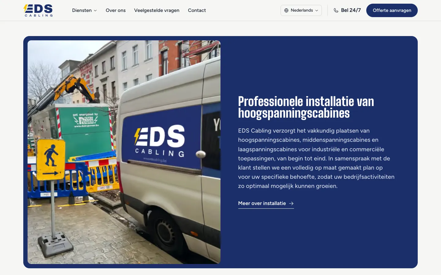
A site rebuilt from scratch, in two languages. Twelve pages in Dutch and French, each with its own address: home, six services (installation, maintenance, renovation, cabling, compliance inspection, 24/7 emergency service), a product page, the company, frequent questions, the quote request and contact. Big headlines, real site photos, wide navy and yellow blocks, and scroll animations.
- A five-step quote request: the services wanted, the cabin's technical details, the project, contact details, then a summary. Plans, diagrams or photos can be attached, and choosing a breakdown brings up the emergency number.
- The 24/7 emergency service: its own page and a yellow band with the number, on the home and contact pages.
- A product page for the QYW-3, a transformer protector the company offers: the device labelled part by part and its own quote request.
- Real Google reviews from clients, quoted with their rating.
SEO built into the redesign
Old addresses are kept or redirected, so nothing Google already knew is lost. Each page declares its Dutch and French versions, with structured data (company, services, frequent questions, breadcrumbs), a sitemap and an llms.txt file for AI assistants. The copy cites the Belgian rules (AREI) and keeps only facts that can be checked, such as the year the company was founded: 2009.
What we delivered
- Logo in three forms (full, EDS only, the E only) on six grounds
- App icon and favicon
- Twenty-eight-page brand book, as a PDF
- Stationery: business card, letterhead, invoice, quote, work order, envelope, e-mail signature
- Print files for workwear, helmets, vans and cabin plates
- Full website design, rebuilt from scratch
- Twelve pages in Dutch and French, including six service pages and a product page
- Five-step quote request and contact form
- 24/7 emergency page and band
- Scroll animations and fast loading on phones
- Old addresses kept or redirected, structured data, sitemap and llms.txt
Will your project be next?
Build your quote in two minutes, or write to us. We reply within 24 business hours.
contact@brightintent.agency